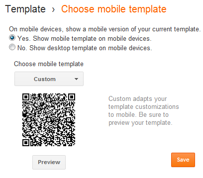
There is some Good news from the Blogger Team on the
Blogger Code Blog. If you have enabled the Mobile
Templates, you will be able to customize the Blogger Mobile Template by
using CSS definitions. You will also be able to control which widgets
are to be shown and which shouldn’t. You can also configure the widgets
to show an alternate content in the mobile view.
Though this looks so promising, I was not able to test all of these features.
Where to Start?
Go to
Template and Click on the Gear Icon below the Mobile Template. From the Dropdown opt for “
Custom”,
Preview the mobile template and
Save it.

Customizing the structure of your Mobile Template.
Blogger Templates are made up using Widgets.Blogger has added a new
property(mobile) to the <b:widget/> tag. This property can take
values ‘default’, ‘yes’, ‘no’ or ‘only’. And this property will
determine how the widget will be rendered in the mobile view.
The widgets that display on mobile by default are the following:
- Header
- Blog
- Profile
- PageList
- AdSense
- Attribution
If you want to hide any of those, then use the property mobile=’no’
in the Widget tag, and that widget would no longer appear in the mobile
view.
For example I can hide the Attribution Gadget in Mobile view if I use
<b:widget id='Attribution1' locked='true' mobile='no' title='' type='Attribution'/>
If you want to display the non-default widgets in your Mobile view, then just set the mobile property to yes.
E.g.: this is the normal tag for the Blog Archive Widget
<b:widget id='BlogArchive1' title='Blog Archive' type='BlogArchive'>
Now if you set the mobile property as
<b:widget id='BlogArchive1' title='Blog Archive' mobile='yes' type='BlogArchive'>
, then you should see the archive widget on your Mobile View(I didn’t get it working).
If you want a widget to appear only in the mobile view, then you can set the mobile property to ‘only’
<b:widget id='Attribution1' locked='true' mobile='only' title='' type='Attribution'/>
If I use this tag, the attribution gadget will disappear from my desktop view, and will appear only on the mobile view.
This code change will make the attribution widget disappear from your Mobile View.
Customizing the Look and Feel of your Mobile Template
Now you can fully customize the looks of your mobile template. The
body element of the mobile template will be styled my the mobile class
<body class='loading mobile'>
Make sure that your template has:
<body expr:class='"loading" + data:blog.mobileClass'>
So if you are good at CSS, you can use this class name to style your mobile template.
.mobile .date-header {
  text-decoration:underline;
}
Alternate Widget Content on Mobile View
Once you switch to the Custom Mobile Template, you might find that
the template is too huge to fit into a Mobile Browser. If you want, then
you can provide alternate content inside a widget.
e.g:
<div class="widget-content">
  <b:if cond="data:blog.isMobile">
    <!-- Show a text link in mobile view.-->
    <a href="http://www.blogger.com">
      Powered By Blogger
    </a>
  <b:else/>
    <!-- Show an image link in desktop view.-->
    <a href="http://www.blogger.com">
      <img expr:src="data:fullButton" alt="Powered By Blogger"/>
    </a>
  </b:if>
</div>
This will show a Powered by Blogger Text link on the Mobile View, and a Powered by Blogger image on the normal desktop view.
The condition
<b:if cond=”data:blog.isMobile”/>
can be used to check if the viewer is viewing your blog in a mobile
browser or not. You can use this conditional check creatively and give a
totally different look to the mobile version of the blog. Happy
hacking, and do share if you have created some really awesome mobile
template
